


How I Turned My “Vibe” Prototype Into a (Rad)ish Experience
I used Lovable to create a fully working prototype for Don’t Kale the Vibe (DKTV), a food waste app with a database of over 80 ingredients. While the UI was clean, I was curious if the UX was actually good. I turned to DataDisco to find out, and the results completely improved my app’s usefulness and usability.
The Power of the Personas
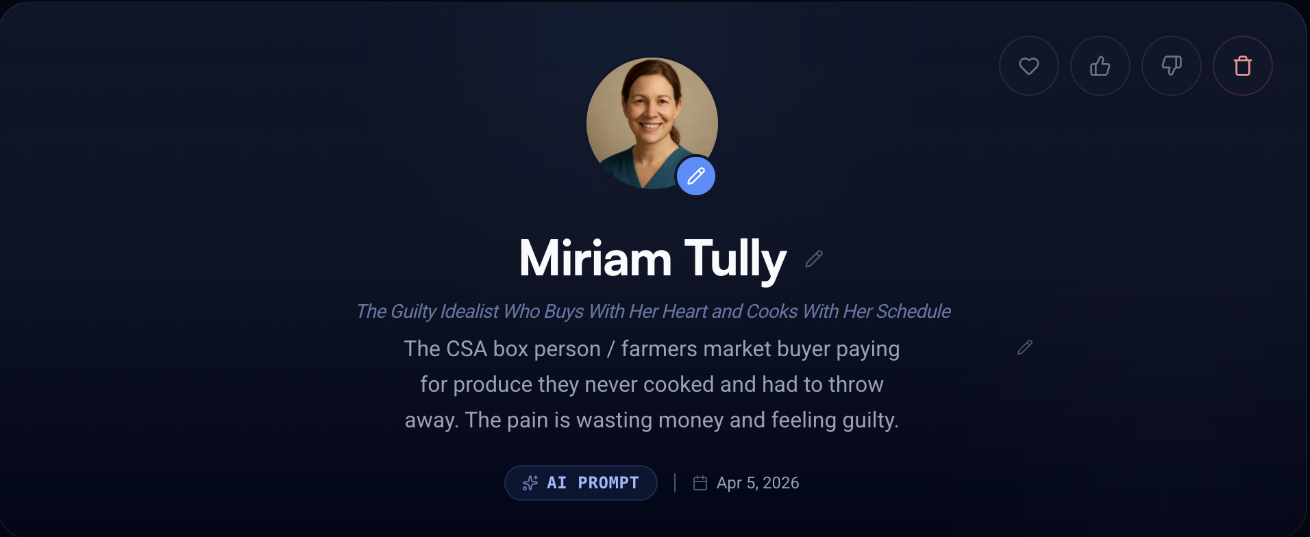
Creating a persona was the first step. I prompted DataDisco with a simple description of a CSA-box buyer who feels guilty about wasting produce. Within seconds, Miriam Tully was born—a 44-year-old dental hygienist from Portland whose busy schedule leads to wilting produce and a ‘familiar feeling of guilt’. I was floored by the level of detail. DataDisco didn’t just give me a demographic, it gave me a deeply human profile with specific pain points and scenarios I hadn’t even considered, like the gap between her ‘aspirational self’ and the reality of ordering takeout instead of cooking.
Real Feedback in Minutes, Not Months
Connecting my prototype was as easy as pasting a URL. I set a simple goal: ‘Is it easy for Miriam to find a tip for preserving a specific ingredient?’. Suddenly, I was watching a simulated think-aloud session. I watched Miriam navigate my app, noting her hesitation when she couldn’t find clear sections. Instead of waiting weeks for feedback, I had trusted insights in just 10 minutes.
Actionable, Heuristic-Backed Results
What impressed me most was that the feedback wasn’t just ‘opinion’—it was backed by Nielsen’s Heuristics and referenced design patterns from top-tier apps like Epicurious. Because of Miriam’s feedback, I made the following high-impact changes:
- Eliminated ‘Message Slop’
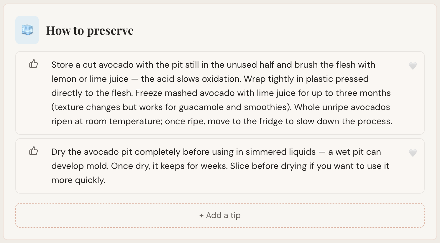
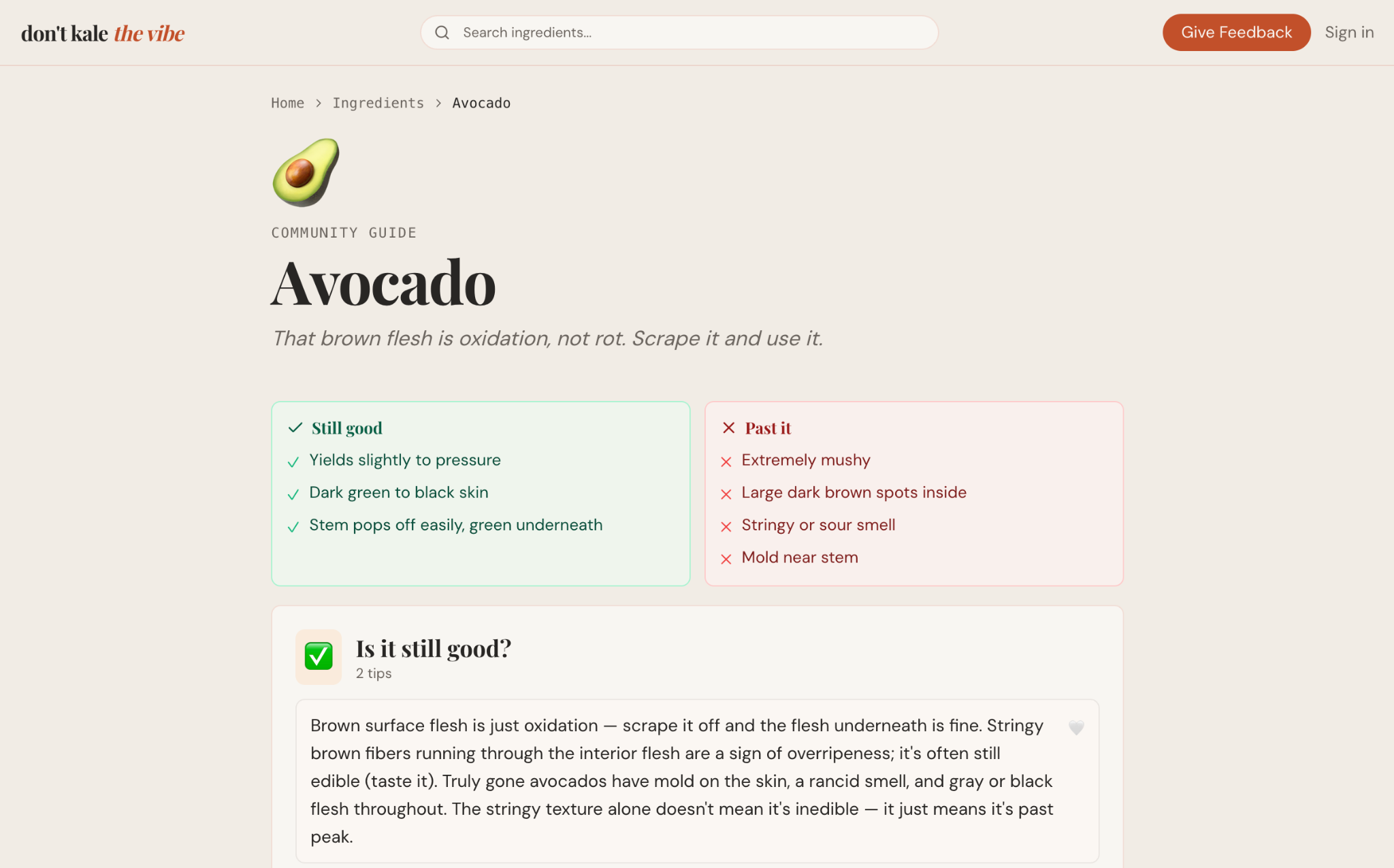
- Changed vague headers like ‘Keep it alive longer’ to clear, actionable ‘How to preserve’.
- Reduced Cognitive Load
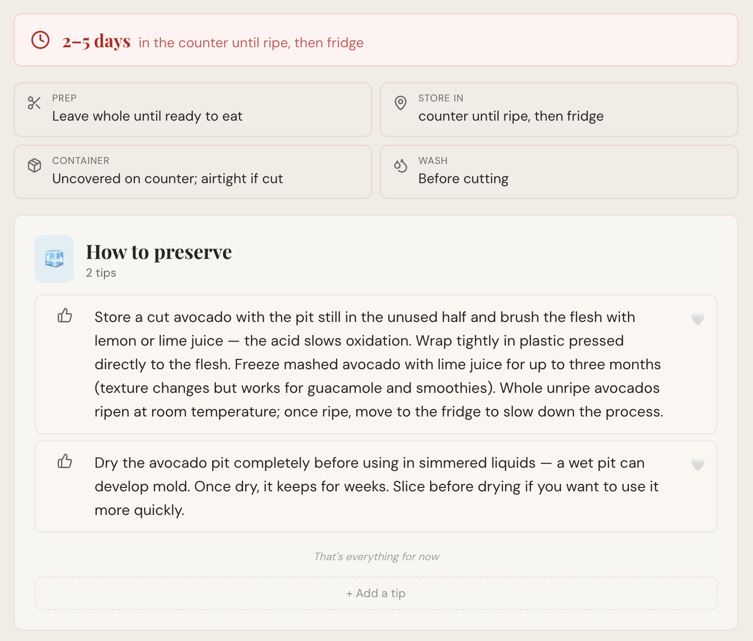
- Added Shelf-Life Hero Badges (e.g., ‘3–5 days’) and color-coded timelines so Miriam can triage her fridge in seconds after a long shift.
- Structured Data for Discovery
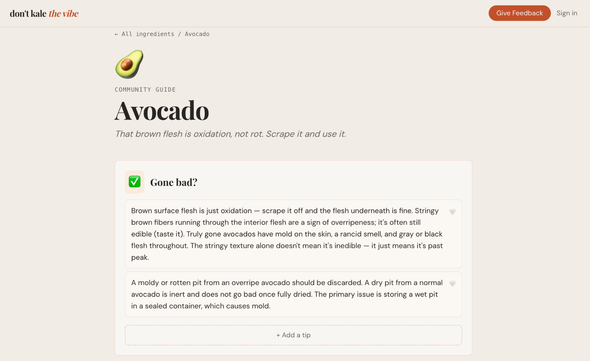
- Replaced prose descriptions with a Scannable Decision Matrix for the ‘Is it still good?’ section, using a checklist format that can be read in under 10 seconds.
- Improved Ingredient Navigation
- Added a global search input to find ingredients from any page, and added categories for ingredients to show related ingredients with similar shelf-life.
- Built Trust through Social Signals
- Implemented upvote counts and ‘Verified’ badges to separate editorial tips from community contributions.
The Verdict: No Longer Flying Blind
Before DataDisco, I was flying blind. Is my app perfect now? No way, but it is much better compared to before. I will say that I have more confidence in my messaging, UI, and UX as I get ready for launch. I’ve already iterated my design three times based on Miriam’s and other Persona feedback sessions. Looking forward to using DataDisco more as I continue to build DKTV.